Thursday, January 30, 2020

Title Research (The Shining)


There is six titles displayed during the opening sequence of this film. The images that are prioritized in the opening sequence include mountains, evergreen trees, and reflective water. These images paired with the score carry a fearful connotation. Over the images, the title sequence is printed in a blue basic font in order to not distract the audience. The genre is reinforced through technical codes from the outset by slowing down each clip and including transitions that match the overall product. The film establishes an enigma from the outset because the audience has many questions that they want answered at the start of the film and this leads to them finishing the film. The strategies that are used to ensure the film appeals to its target audience are the soundtrack, the editing is slow, and establishing the location. Technology has been used effectively to create the titles and their transitions , add the score, film the camera angles/movements, and to successfully create the opening sequence of the film that catches the viewers attention. 

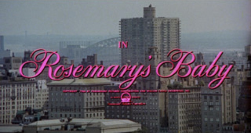
Title Research (Rosemary’s Baby)


During the opening sequence of the film, there are nine titles displayed. The images that are prioritized in the opening sequence are of tall buildings in a city. The connotation that the images carry are uplifting surprisingly, since the view is shown from high above even though the film belongs to the horror genre. The font color of the titles is hot pink, which represents femininity and the state of being delicate. The genre is reinforced through symbolic and technical codes by the score that is included and the editing that is slowed down. This film does not have any special effects, and this can make it scarier to viewers since the scenes more realistic. The shots in the opening are all of New York City and they paint the city as a lonely place. The film establishes an enigma from the outset by the creepy music and the contrast between the title colors and the shots that were used. To ensure the film appeals to the target audience the perfect score is included along with the connotation that is behind the images that the producers incorporated. The technology has been used effectively by the transitions that are used, the slow editing, music, title font/color, and lastly the camera angles/shots themselves.

Title Research(Great Expectations)


In this title sequence there are seventeen titles included. The images that are prioritized in the opening sequence are of a patterned butterfly that turns black during the title, mysterious wedding dress, and an object that looks like a wooden boat. The images carry a dark connotation and they leave the audience feeling uneasy and curious as to what will happen leading up to the end. The genre is reinforced through symbolic and technical codes by the editing and the pictures included. The lighting is not bright whatsoever and throughout the whole opening sequence the viewer gets a sense of intrigue at the same time that they are on the edge of their seat. The film establishes an enigma from the outset by the score that is included along with the images that tell a story on their own. The audience begins to wonder what the purpose of including dark images with the soft music is. Many strategies are used to ensure the film appeals to its target audience such as including a corrupting image of a butterfly, modifying the film through editing techniques that made the haunting scenes full of darkness. Technology has been used effectively to ensure that the camera angles in the introduction meet the requirements that they were hoping for. The transitions in this sequence add on to the desired feeling of the film. The editing techniques used contribute majorly to the audiences choice of whether or not they should continue watching.

Title Research: Watch the Titles Website

I am looking at this site for the same reason I used the other one, I plan to use the examples that I find   as a guideline to create my very own product. This website was similar to the first one that I viewed and both of them provided a variety of examples to watch of opening sequences. The videos focus mainly on the titles that are included and the visuals that are presented. I wanted to be inspired by the different common themes that are included in each of the introductions. I saw that there are many different types of media such as tv shows, video games, student projects, and feature films. Both of the websites present the same amount of film types, however, they include examples that differ from each other. I researched the horror genre on this website as well since that is the type of film that I plan to make. I learned that you must be specific when searching a genre because not only movies pop up. This is important because for this task we are only required to research opening sequences to movies. I also found that the first website has more of a selection than the one I am looking at currently. When I searched up the horror genre for movies specifically no examples came up at all. This makes conducting research on my genre choice difficult. I learned that you get better results from clicking feature films rather than trying to use the search bar for specific examples. I believe that both websites can be useful and I plan to utilize both of them to begin my own work. I will definitely use the Art of the Title Website more frequently but I believe both of them will be beneficial.

Tuesday, January 28, 2020

Title Research: Art of the Title Website

At this time, I am currently researching titles for the project that I am in the process of. As I was searching for different examples I stumbled upon two websites that are credible and useful. The first website that I found is known as “www.artofthetitle.com”. More specifically, I decided to conduct some research because I plan to create my own opening sequence and this website can provide ideas and techniques for my product. When you search this website, the first thing that comes up is the homepage with a mini selection of title sequences from the past year. You have the option to select whatever genre and movie you want through the search bar. The website allows you to choose from either title sequences and designers/studios. I researched the horror genre on here, since this is the genre I picked for my own product. When I searched the genre up a variety of suggestions popped up and there were many films to choose from. On the bottom of each film, the type of media is shown to distinguish each of them. This is useful since we are only allowed to use movie examples and this website provides other film types. The website has a mix of interviews and summary’s especially for the genre that I have chosen. I have learned that editing is a major role for film and it has the ability to intrigue the audience during the start of the film. I have also learned that titles can be placed towards the end of the movie rather than at the beginning. I look forward to researching further by utilizing the other website that I found.

Sunday, January 26, 2020

Genre Research(The Babadook)

To start off, a medium shot is included in this film of an empty room to create a feeling that there is something that is about to occur within the room. A birds eye view is shown of a mother and child in bed at a vertical angle allowing the audience to see their facial expressions easily. Another angle in “The Babadook” is an extreme close up of the boys eye while the doctor is examining it which draws the viewer closer to the characters. Due to this film being situated mainly inside their house, the character’s costumes are considered to be normal clothing. The lighting for the movie consisted of black and white lights. Many shadows and fading lights were included adding onto the overall mood of the film. The body language and facial expressions throughout each scene gives the audience a clue as to how the characters are feeling in the moment. Makeup is used to a small extent in this film other than a few circumstances. The main villain wore makeup to resemble the drawing and to represent who he was. Two props that were major to the film are the book and a knife.  The book was very important since that was the object that started the conflict and released the creature that began all of the events. As mentioned earlier, the setting was located in the family’s home and briefly at the doctors office. Diegetic sounds are used in the form of loud noises, dialogue, and screaming throughout the film. The dialogue of the creature has a much deeper and slower voice than the other characters making the viewers feel uncomfortable. Non diegetic music is also included when they turn the pages of the book and the chiming of a drone. The colors in this film have been de-saturated through editing so that any bright colors are seen as pale/dull creating a dark and dramatic atmosphere. This film uses elements to create an uneasy visual atmosphere and the editing of this film intensified each scene correctly. I liked how they edited the colors of the film to match the mood that they wanted to set for the movie in general. No elements that were included failed to appeal me during the research of this film.

Genre Research(Insidious)

An establishing shot is including to set the scene and to show where the horror is about to occur. The establishing shot shows that the characters live in a big suburban house in a nice neighborhood and the ordinary lives that they originally had. An eyeline shot is used which puts the audience in the position of the protagonist, and this gives the audience an unsettling feeling that makes them question why the camera is focused on the specific angle. The use of an extreme high and low angle shot is also shown to make the mother’s character appear to be small and insignificant compared to the vast staircase towering over her. A slow zoom is included towards the clock to give the illusion of someone walking in the same direction as the camera. This makes the audience feel disoriented and forces them to focus on the object. The parents wear normal everyday clothes showing the simplicity of the family. The demons/ghosts wear older clothing for their costumes since they are from the 19th century. When the film shows the normal world, the lighting is slightly yellow and when they are in the further there is a grey/blue filter so the audience can differentiate between the two. The parents in this film represent a man with a good job and a woman being left at the house during the day. Makeup played a key role in the making of this movie, mostly to create the scary look of the antagonists. A main prop that is included in this film is the drawing of the villain. This creates suspense because the only way to see how he looks is through the blurred drawing. A gas mask is also another prop that was used to add onto the horror theme. Just like other horror films, there is a limited amount of settings. The main settings in this film are the family house and the hospital. Most of the scenes are in their house to show what is happening in their place of comfort and security. In this film, there was a minimal amount of music that was only used during intense scenes. Most of the music is non-diegetic but there is one scene near the beginning of the film in which the mother plays the piano. This film is edited with quick cuts partnered with added titles. The editing speeds up towards the end to provoke the feeling of chaos. Insidious included editing that fastened in speed, creepy sound effects, a limited amount of locations, and many other techniques. I enjoyed the amount of intensity that was included but I would have included the score more frequently.